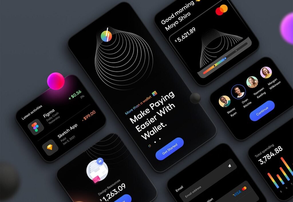
Dark mode has become a prominent trend in digital design, offering users an alternative to traditional light-themed interfaces. Its growing popularity stems from the aesthetic appeal, reduced eye strain, and energy-saving benefits, particularly on OLED screens. However, designing for dark mode isn’t as simple as flipping colors—it requires thoughtful consideration of aesthetics, accessibility, and performance. Let’s dive into how to achieve the perfect balance.
1. Understanding the Appeal of Dark Mode
Dark mode interfaces feature darker backgrounds paired with lighter text and elements. This high-contrast design provides a sleek and modern look, appealing to many users. Additionally, it helps reduce glare in low-light conditions and saves battery life on devices with OLED screens by minimizing the energy needed to light up pixels.
2. Aesthetics: Making It Visually Appealing
While dark mode offers a stylish alternative, it’s crucial to maintain visual harmony:
- Color Choices: Avoid pure black (#000000) as it can be too harsh on the eyes. Instead, opt for dark gray shades (#121212 or #1A1A1A) to create a softer and more comfortable background.
- Contrast Levels: Ensure sufficient contrast between text and background to maintain readability without overusing bright white. Subtle off-whites or muted tones can help.
- Accents and Highlights: Use vibrant accent colors sparingly to draw attention to key elements without overwhelming the interface.
3. Accessibility: Designing for All Users
Accessibility is a cornerstone of effective dark mode design. Consider the following:
- Text Readability: Use tools like WCAG (Web Content Accessibility Guidelines) to ensure contrast ratios meet accessibility standards (at least 4.5:1 for text).
- Colorblind-Friendly Palettes: Test your designs for colorblind users to ensure critical information isn’t conveyed solely through color.
- Adaptability: Allow users to switch seamlessly between dark and light modes based on their preferences.
4. Performance: Optimizing for Efficiency
Dark mode can impact performance, especially on devices with OLED screens. Here’s how to optimize:
- Energy Efficiency: Prioritize dark backgrounds and minimize bright, full-screen elements to reduce power consumption.
- Dynamic Theming: Implement system-based dark mode detection and adaptive theming to improve user experience.
- Testing: Regularly test your designs on different devices and environments to ensure consistency and performance.
5. Best Practices for Implementing Dark Mode
To create a successful dark mode interface, follow these best practices:
- Start with Light Mode: Design light mode first, then adapt it to dark mode to ensure consistency and usability.
- Avoid Over-Saturation: Keep colors subtle and avoid oversaturating UI elements, as bright colors can appear harsh against dark backgrounds.
- Focus on Typography: Ensure text remains crisp and legible by using appropriate font weights and sizes.
- User Testing: Gather feedback from real users to refine your dark mode designs and identify potential issues.
Conclusion
Designing for dark mode requires more than just inverting colors; it’s about crafting a user experience that is visually stunning, accessible to all, and optimized for performance. By balancing aesthetics, accessibility, and performance, designers can create dark mode interfaces that truly enhance the user experience. As dark mode continues to dominate the digital space, mastering its design principles will ensure your interfaces remain relevant and user-friendly.